A brand identity project
I had the amazing opportunity to put together a branding package for Maegan, from Letters From My Hart. This is one of those projects that excites me. (And not just because it’s for my baby sister.) There is something about branding that lights up so many different areas of my brain. It’s a little organization, a little creativity, and a lot of self-expression. (Hi, I’m an enneagram 4.) Obviously i’m not expressing myself, but I get to help someone else define and express themselves through their brand. The organizer in me was having a hay day because I even got to create an order form for her to use and work on her processes. I would love to take this project a step further and design packaging. I geek out over this stuff!
So what was the process like?
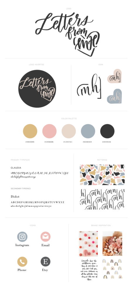

1. The first step was the name. She started out doing hand lettering as a hobby, and she knew she wanted to create something inspiring. The first pass was Letters From The Hart. Yes, HART because her last name is Hartson. We changed “the” to “my” to use her initials, M.H. And there we have the name: Letters From My Hart was born.
2. Icon: Every brand has an iconic symbol that can be used to stand alone in place of the logo. Now, I literally designed this into the complete logo with the intention of pulling it out as the icon.
3. Color: I had her create a Pinterest board of photos with an aesthetic that spoke to her. As I was scrolling through, a slight color theme caught my eye. We took a few of those images and drew colors straight from the pictures: Mustard, Pink Lemonade, Cream, Slate, and Charcoal
4. Font: I chose Claudia because it looks almost identical to Maegan’s cursive and it can be used in cases where it isn’t practical for her to hand write it. Didot brings an elevated feel to the brand and keeps it grounded.
5. Pattern: I created two custom, seamless, patterns that represent two facets of this brand. The top is fun and bright, reminiscent of confetti. The second is more elevated and classic. Creating a seamless pattern takes some serious TIME. It was a first for me and I love how they turned out.
6. Communication Icons: These are the least concrete, as she will likely add more as her business grows. We will probably work together on creating a more custom look rather than this basic approach. The biggest thing about this branding package is there is room to GROW. There has to be room to grow. Time changes things, it changes styles and things evolve. I was intentional about thinking forward about how things might change and how these elements might be manipulated to reflect that.
7. Inspiration: These are some of the photos that served as the inspiration and feel of Maegan’s brand. They’re fun, feminine, and a little whimsical. The rainbow pattern was actually created by Maegan herself after the other design elements had been created. I was so proud because as a creator it meant that I was able to curate her aesthetic in a way that was both inspirational and in line with her style. It provided the framework for her to create from the heart. Basically, I did my job so she could do hers!
A lot of this happened simultaneously and fed off of each other. It’s hard now to put an order to how it came to be. It’s like the chicken and the egg, which came first?
Is it all about the visuals?
There is more that goes into creating a brand identity than just the visuals and we did that stuff too. We worked on her mission, values, and goals. We talked about what she wanted her brand to communicate and what message she wanted to send. My favorite thing to come out of those conversations was to hear her say:
“I also want people to feel inspired to explore their passions and go for their dreams without fear. I’ll do this by posting encouraging words and scripture through out my social media, and in my artwork, and through conversations with customers.”
This is the bloodline for Maegan. It’s who she is, she is an encourager who doesn’t want to just fulfill an order, she wants to talk to and inspire her customers.
“Out of the abundance of the heart, the mouth speaks.” Matthew 12:34
“A good man brings good things out of the good stored up in his heart..” Luke 8:45
My dearest dear, Maegan’s heart is good, therefore the words that come from it are good. Letters From My Hart isn’t just a name or a brand, it’s literally from her heart.
Very creative and thoughtful. Every design element is purposeful. Love the approach you took to give Maegan’s business the packaging she needed to polish her marketing. Great job.
Thank you! Maegan is easy to work with and super talented!
How exciting! I can’t wait to hear more from both of you!
Thank you, Judy! <3